Exploring the Secrets of an Empty Frame
Composition in art and photography is an extremely complex subject that involves more than just the standard set of 'rules' that we are so fond of as photographers.
Most of us (me included) come to photography without any artistic training and we have to fumble along using trial and error.
We may see other photographers' images and compositions and try to emulate them and learn by example.
We may also learn from paintings, product photography, graphic art and movies. However, I think, speaking from personal experience, that very few of us try to develop a conscious understanding of the visual systems we employ when taking a picture or looking at a picture.
Instead, we probably shoot what we feel and lean heavily on the experience of what may have worked in the past.
When looking at an image, even very simple ones, there are multiple competing elements. I feel that in general they can be broken down into three major components:
The frame/crop or format of the image. Square, round, rectangular etc... This might seem like a strange component to include or maybe it's obvious?
The graphic elements. The simple shapes, colours and brightnesses that make up the image. Not the objects mind you, just the raw shapes.
The context, the way that the shapes and colours relate to each other, then resolve in our consciousness to become understood and interpreted.
In this post, I want to talk about the first component, the empty frame alone.
The empty frame...
Rectangles
Rectangles are everywhere, in our world. Walls, doors, phones, laptops, TV's, windows, advertising hoardings, buildings, postcards, books, artworks, cereal packaging...everywhere in our human world.
But what about nature? How often do we see rectangles?
I'm struggling to think of any examples.
Why do we humans love the rectangle so much?
What is it about this shape that entwines itself with our consciousness?
Is it purely something we have learned to interpret despite its absence in nature?
While I think that learned experience plays a part in our fascination with rectangles, I also feel that there is a deeper connection to our interpretation of the shape.
If we look at a blank rectangular canvas, we don't see a non-picture. We bring ourselves to it. Our interpretation or experience of the world and other similar shapes. We apply rules to the empty shape, ideas, assumptions - whether we are aware of it or not.
Gravity
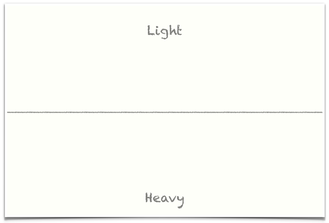
Gravity is the most immutable and obvious force in our experience of the world. It is totally pervasive, it is everywhere, battering and holding us from cradle to grave. It has shaped and educated us to think a certain way about our blank, rectangular canvas. Our canvas has a top and a bottom. Without our relationship with gravity, it wouldn't have a top or a bottom,
We are almost certain to recognise immediately if the canvas is not level, even when looking at it without any other frame of reference. It will feel unbalanced, unsatisfactory, somehow precarious and wrong. Many of us will feel an urge to straighten it.
Fighting the urge to straighten this canvas
Because our canvas has a top and a bottom we subconsciously add something else to it: A horizon line. The lower half is grounded, solid, more comfortable and attractive to our eye. The upper half is less attractive, less solid, more like the empty sky.
Centres & Lines
Think about the rectangle, this empty canvas, with its top, its bottom and its centreline or horizon. It is easy to divide into three major lines, Top, bottom and centre. It's not difficult to find the centreline/horizon with our eye. Our consciousness is immediately aware of where it lies. It feels fine to divide the short sides in two and join them. Somehow natural.
For me, at least, finding the diagonals also seems fair and natural. I can achieve it without any conscious thought. I don't get lost or misinterpret where they are. They just are.
Together, the horizon and the diagonals build the centre. It also just is. I don't need to work to understand where it lies, it just pops out of the canvas as one simple aspect of the rectangle. If I point to it with my finger and lean forward to touch it I will find it every time with uncanny precision.
The same is not true of the vertical centre line. I can see it and find it, but it doesn't sit quite as comfortably in my mind as the other lines. There is a reason for that. It is dynamic and unsteady. Dividing my rectangle in this way creates two smaller rectangles in portrait. They feel wrong. at odds with gravity, almost as if they should be rotated to form their own, smaller, blank, rectangular canvases.
To my mind, the vertical centreline is not as powerful a line as the bottom, top, horizontal centreline and the diagonals. It feels somehow subservient in my imagination.
Rabatment
There are stronger lines than the vertical centre line.
Squares are also somehow natural for us. We build them into the empty canvas, again without really thinking. Try it, look at a blank A4 piece of paper in landscape orientation and, without measuring, draw a single line to indicate the square on the right side of the piece of paper - then measure the sides, without a doubt, you will be fairly close.
Our ability to do this subconsciously and without any effort is known as the Rabatment of the Rectangle.
These edges of the left and right square are lines of power. We are drawn to them, just as we are drawn to the top, bottom, horizontal and diagonals.
It may have become obvious to you that these are the building blocks of the geometric 'Rule of Thirds' when applied to a 3:2 photograph. The Rabatment lines will coincide with the thirds.
Stability
We talked about gravity and how our canvas has a top and a bottom. These two components interact to influence an invisible feature of our canvas. Invisible, that is, until we draw something.
The object we draw will either be balanced or off balance and uncomfortable, depending on how it relates to the sense of stability we apply to the blank canvas.
If we draw a vertical line or a horizontal line these will feel stable in relation to the subconscious world we project into the canvas. Any angled line will not.
The same sense is violated where we draw a large shape near the top of the canvas. We might have the urge to rotate the canvas so the shape is now near the bottom. Somehow, there, it feels more natural and less dynamic. Perhaps less likely to fall?
Tension
We are acutely aware of the edges of the frame. The sides, top, bottom and corners constitute the edges of the pictures' world. We are very aware of the centre as well.
The closer we place objects to these edges of the pictures' world the more tension we create in the image.
Artists rarely place their subjects dead centre. Off-centre creates more tension. We know where the centre is intuitively and subconsciously we ask ourselves a question: Why is the subject not centred?
The same is true of objects near the edges. The tension builds the closer they get until, to us, they feel too close.
Perspective
The camera can be said to be a tool to capture perspective but perspective has not always been around. The first single perspective drawings and paintings started to appear in the 1300's, before that, the images were more pictorial and stylised.
Perspective isn't just a technology that we have developed, we see the world in this way naturally, and perspective drawings succeeded in recreating aspects of this on a flat, two-dimensional plane. This doesn't mean that non-perspective drawing cannot be understood. We can learn to interpret it just fine but I don't want to head into the realms of semiotics just now!
The point I'd like to make is that 500 years of perspective drawing and 120 years of perspective photography has conditioned us to interpret our blank canvas in terms of perspective rather than using another visual mechanism.
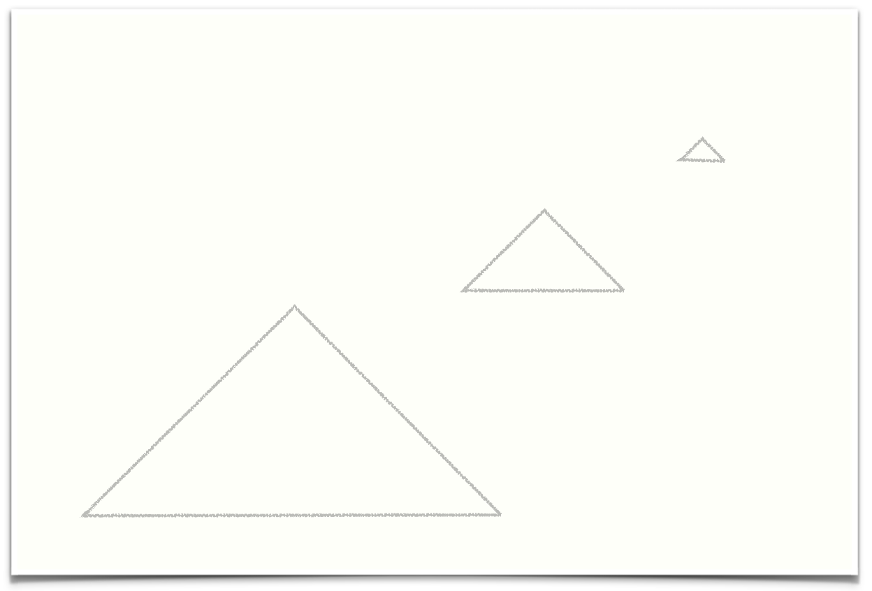
For example, smaller objects appear to be further away while larger objects seem closer. The most distant objects might vanish, into a point.
Signifier and Signified
I said I didn't want to delve into semiotics and here I am doing just that.
I just want to end on the idea that images cannot escape their context. In my understanding of photographs, context is derived from two places; the image itself and the viewers projection of his or her own world into the image.
Much of this meaning arises (according to semiotic theory) because, to us, the objects in the image signify a concept or understanding. The objects are not in themselves the same thing as that concept or understanding, we merely take them to be analogous with or signifiers of, the concept or understanding that we have in mind.
For example, the word 'dog' is arbitrary. The word 'dog' is NOT of itself, a four legged animal.
It is a jumble of shapes (the signifier), that reminds English speakers of their experiences of real-world four legged animals (the signified).
To a speaker of another language, the word 'dog' does not mean anything at all.
The same thing is true for images and colours. They cannot escape the meanings that they are associated with in the mind of their observer. These meanings are never uniform and each of us brings our own, individualised, world into every image we look at.
Even the empty frame.


![Goodlet_161127_[_G5D5447]--HDR-Edit.jpg](https://images.squarespace-cdn.com/content/v1/586fc0a6bf629abf69254ce7/1536583210690-FHFAE6CAKZJKSSWCQ9RZ/Goodlet_161127_%5B_G5D5447%5D--HDR-Edit.jpg)


